
ZOÉ
Plant-Based Food
Branding Ecosystem
BEYOND THE PLANT-BASED CODE
An identity
built for ZOÉ
BEYOND THE PLANT-BASED CODE
An identity built for ZOÉ
ZOÉ was born as a plant-based food concept and developed through a branding system designed to connect identity, physical space, editorial communication and digital presence.
The project approaches the brand as an ecosystem, building a coherent presence across every touchpoint.
From the logo to the coordinated image, from the environment to printed communication, from the responsive website to social media, every element was designed as part of a single visual architecture.
The result is a contemporary, recognisable and flexible identity, conceived to adapt to the different contexts in which ZOÉ takes shape.
UNCONVENTIONAL PLANT-BASED
A visual signature beyond the stereotypes
ZOÉ’s plant-based character is translated through a distinctive visual language, far removed from the more predictable codes of the natural and wellness sector.
The design seeks a balance between immediacy, contemporaneity and memorability, building a personality able to stand out within the Food and Ho.Re.Ca. landscape.
The logo forms the core of the identity and is developed alongside a coordinated system of graphic elements, typography and applications.
The same visual grammar is then carried across the various communication tools, maintaining recognisability even as format, function and context change.
The brand identity thus becomes an open system, designed not only to identify ZOÉ, but to build its perception through a plurality of touchpoints.

UNCONVENTIONAL PLANT-BASED
A visual signature beyond the stereotypes
ZOÉ’s plant-based character is translated through a distinctive visual language, far removed from the more predictable codes of the natural and wellness sector.
The design seeks a balance between immediacy, contemporaneity and memorability, building a personality able to stand out within the Food and Ho.Re.Ca. landscape.
The logo forms the core of the identity and is developed alongside a coordinated system of graphic elements, typography and applications.
The same visual grammar is then carried across the various communication tools, maintaining recognisability even as format, function and context change.
The brand identity thus becomes an open system, designed not only to identify ZOÉ, but to build its perception through a plurality of touchpoints.
BRANDSCAPE
Identity becomes environment
BRANDSCAPE
Identity becomes environment
One of the interventions concerns the translation of the identity into physical space.
The creative direction proposed a mural roughly four metres wide, subsequently realised by Ada_rt (Ada Trifiló) through the pictorial representation of a plant.
The painted element was later brought into the creative direction and integrated into ZOÉ’s visual system, transforming it into an identity mark applied throughout the whole project: from the signage to the hanging menus, from promotional flyers to other communication materials.
The mural was thus integrated in relation to the brand’s overall identity, rather than as an isolated decorative element. Its reworking and application across the different touchpoints created visual continuity between wall, signage, editorial materials and environment, carrying the same graphic element across different scales, media and functions.
The identity thus takes on an environmental dimension: the visual language enters the space, defines its recognisability and builds a coherent brand presence between architecture, communication and audience experience.
FROM MARK TO USE
A visual grammar
for every format
FROM MARK TO USE
A visual grammar
for every format
The design extended the identity into an articulated communication system for the venue’s everyday life. Printed menus, hanging menus, promotional materials, flyers, cards and other media were designed and coordinated within the same visual direction.
Each application was studied in relation to its function: information hierarchy, readability, size, modes of consultation and context of use all contribute to defining the graphic solution.
Editorial design thus becomes part of the brand experience: each material retains its own communicative function while contributing to ZOÉ’s overall recognisability.
DIGITAL TASTE
The experience continues online
The responsive website extends ZOÉ’s identity into the digital space, maintaining continuity with the language developed for the venue and for the physical materials.
The structure organises the presentation of the concept, the brand’s story, the online menu and the information needed to connect with the audience.
The UX design is oriented towards clarity of navigation and ease of access to information, also integrating links to Just Eat, Glovo and Deliveroo to allow direct access to the main food delivery services.
The digital structure is thus designed to guide the user from discovering the concept to browsing the offer, all the way to ordering, maintaining coherence between identity, content and functionality.
DIGITAL TASTE
The experience continues online
The responsive website extends ZOÉ’s identity into the digital space, maintaining continuity with the language developed for the venue and for the physical materials.
The structure organises the presentation of the concept, the brand’s story, the online menu and the information needed to connect with the audience.
The UX design is oriented towards clarity of navigation and ease of access to information, also integrating links to Just Eat, Glovo and Deliveroo to allow direct access to the main food delivery services.
The digital structure is thus designed to guide the user from discovering the concept to browsing the offer, all the way to ordering, maintaining coherence between identity, content and functionality.
THE SPHERICAL METHOD IN ACTION
THE SPHERICAL METHOD
IN ACTION
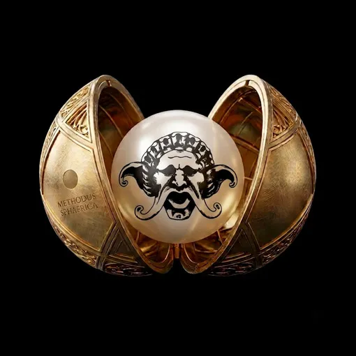
In the ZOÉ project, the Spherical Method is applied to build connections between different elements: identity, space, content, editorial materials, digital experience and communication are treated as interdependent parts of a single system.
This approach makes it possible to identify the project’s identity core and make it recognisable through different applications, without reducing it to mere graphic repetition.
The subject of the mural, for instance, enters the visual system and is translated into the signage, the menus and the promotional materials; the same design logic then continues into the website and the social media setup.
Complexity is therefore not eliminated, but organised through coherent relationships between elements, functions and contexts.
Each touchpoint retains its own specificity while, at the same time, contributing to the construction of a unified perception.
For ZOÉ, the Spherical Method thus becomes a tool for transforming plant-based identity into an integrated brand ecosystem, in which coherence arises from the relationships between the parts rather than from their simple uniformity.
END-TO-END VISION
From identity
to experience
END-TO-END VISION
From identity to experience
ZOÉ was developed as an organic identity and communication project, in which branding, creative direction, editorial design, physical space and digital presence converge within a unified vision.
The work included the design of the logo and coordinated image, the development of the visual system, the proposal and coordination of the venue’s mural, its integration into the signage and graphics, the design of menus and promotional materials, the responsive website, the online menu, the digital content structure, the links to delivery services and the coordinated setup of the social media presence.
The project interprets branding as a multidimensional system: an identity capable of moving across space, print and digital, maintaining a unified creative direction and turning every touchpoint into part of the same brand construction.